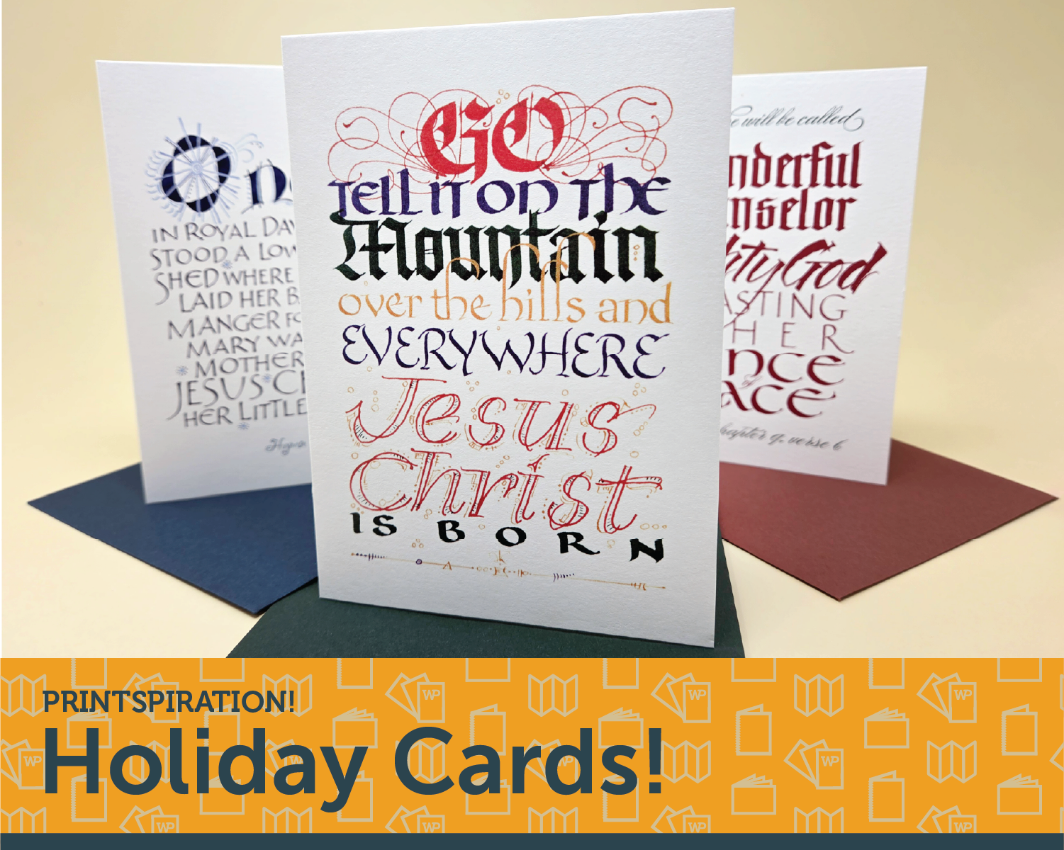
Prinspiration! Holiday Cards
The school year is still fresh, the leaves are starting to change, pumpkin spice is on every menu whether you like it or not, and Labor Day just marked the true end of summer. So what should you be thinking about? Obviously, HOLIDAY CARDS! The biggest printing time of the year!
You thought you could get away with NOT thinking about the FUN obligations of the end of the year? Just because it's September? That sort of thinking is what MAKES it feel like an obligation! The luxury of time gives you more freedom, and that means you can take advantage of ALL THE WILD THINGS WONDERPRESS OFFERS! You’ll definitely show your perfect cousin up this year with that amount of time.
You have time.
You can order specialty paper (You want that premium red. Wild Cherry just won’t cut it. Imperial Red? No, too bright. You need that Colorplan Vermillion or nothing)
You can change your mind about toner (You set it up for gold throughout not realizing you could have had TWO SPECIALTY TONERS!! Struck with inspiration, you edit the whole thing to utilize GOLD and WHITE!)
You can adjust the shape (You stare at the proof, seeing that you designed both sides to the left instead of flipping the back side. But you gave yourself time! You started thinking about this in September! YOU HAVE TIME TO ADJUST!)
So, we special order this perfect red and you figure out how to utilize both gold AND white on your perfect shade of red and set up the die to make it the perfect custom shaped card. You have a project so unique that everyone high fives** you at the office party. All because you planned ahead and let your imagination go WILD!
(**High fives are not guaranteed, this is only available if you work at a cool office.)
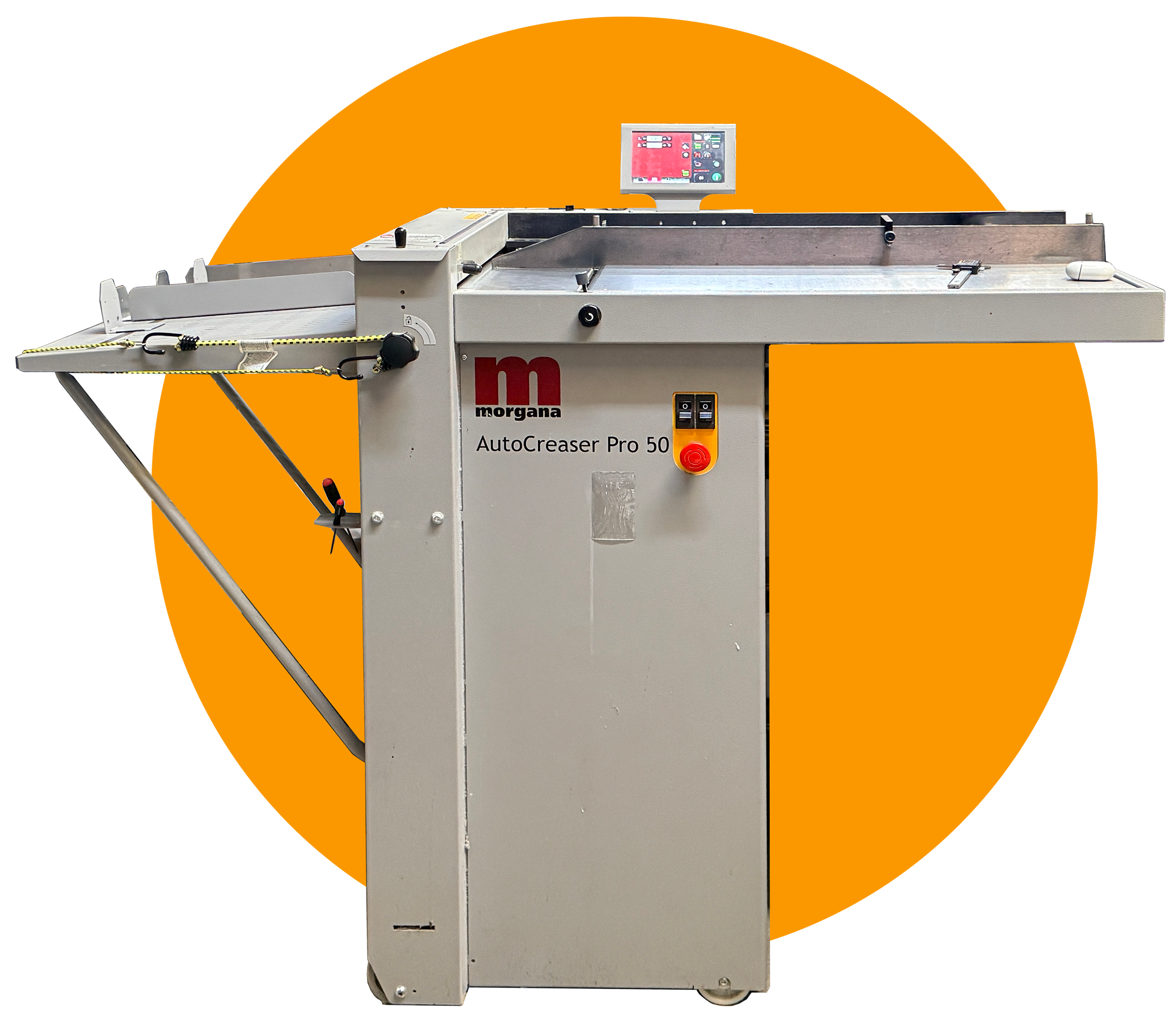
Today we want to show off an unsung hero of the bindery–the Morgana Auto Creaser Pro 50! Can’t call it “the Morgana” because we have a few pieces from this company. Gotta say the full name. With RESPECT. This is our oldest Morgana piece, at 10 years old, and we use it daily!
Some cool specs we love:
Can crease a 12x18 sheet SIDEWAYS, most creasers can’t go up to 18”
The reason we use a creaser over a folder is that by creasing the sheet instead of jumping straight to folding is that the crease protects the toner from cracking.
A sheet can run through twice to give two perpendicular lines to create interesting folds beyond a trifold brochure!

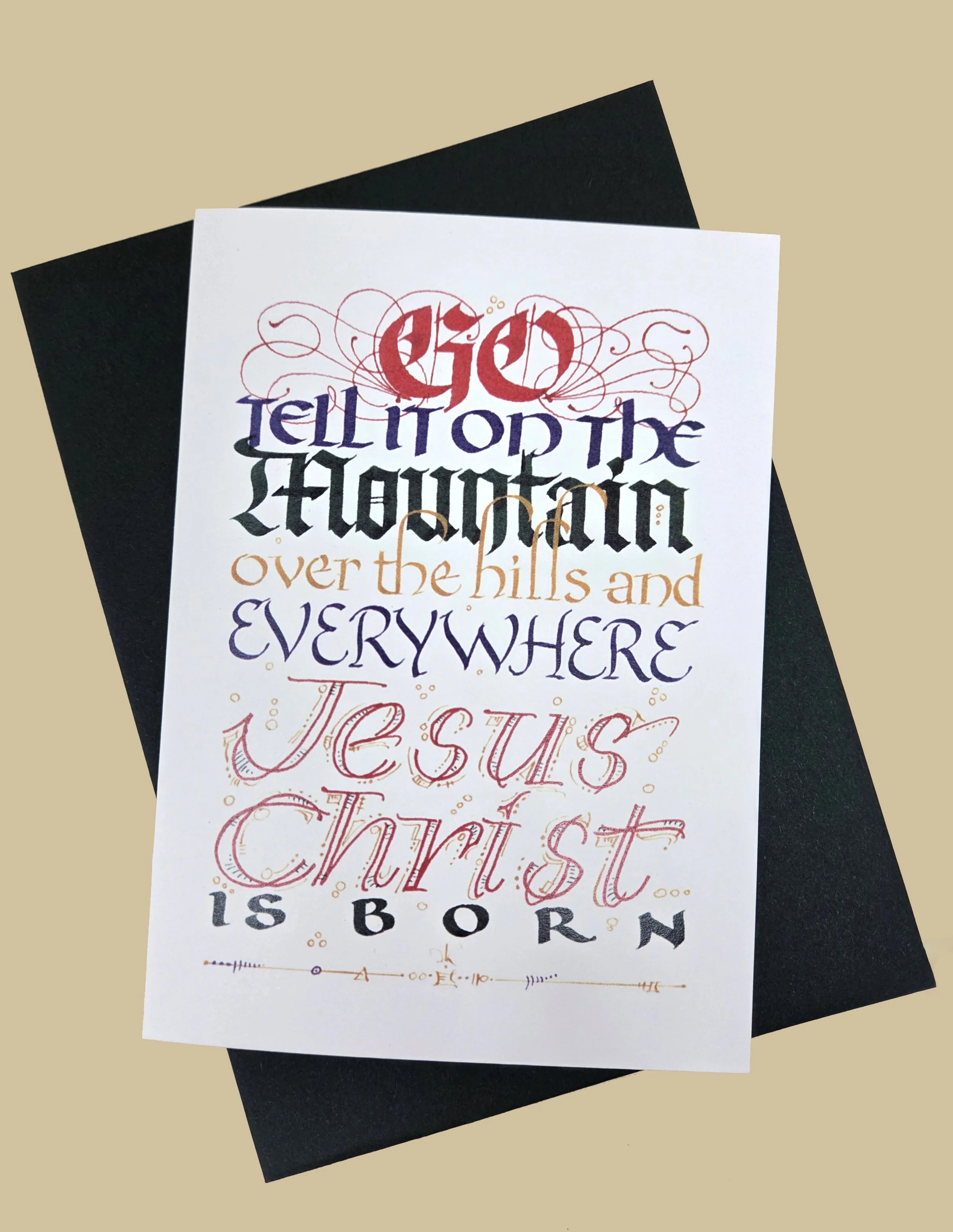
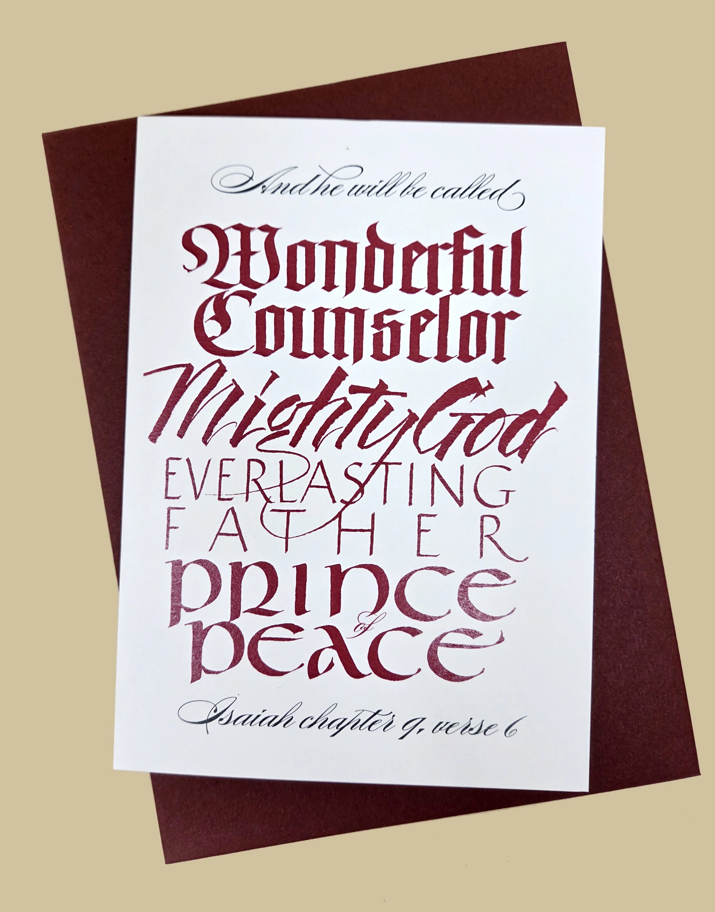
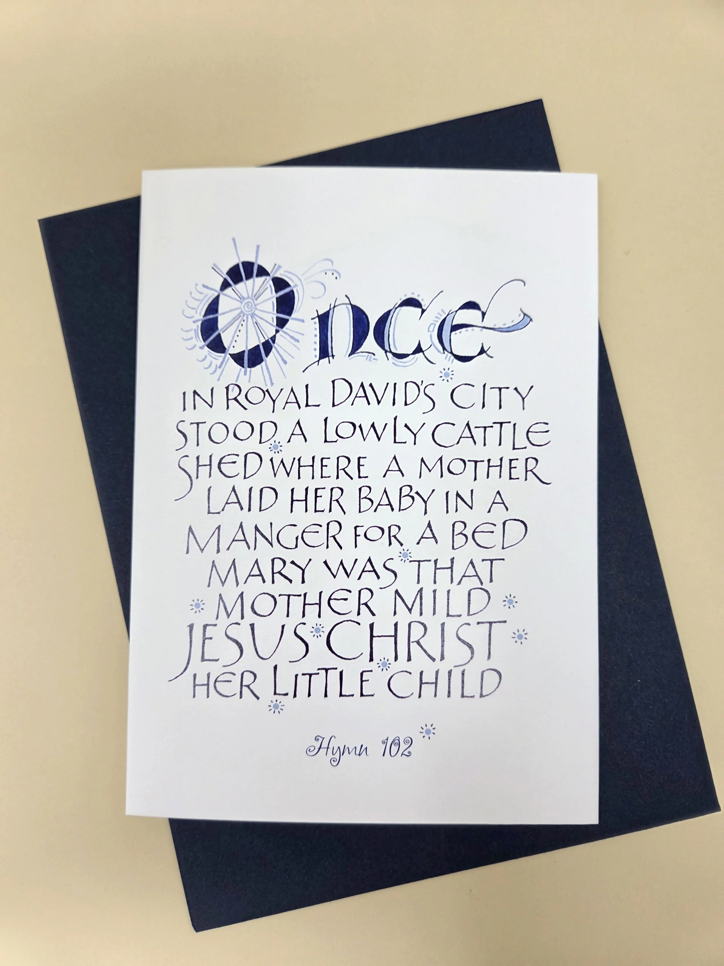
DIANE JONES has loved writing since the 3rd grade, when she would forgo recess to practice cursive handwriting in the classroom. She went on to receive her BFA with an emphasis on graphic design from Stephen F. Austin State University in Nacogdoches, TX. Diane also studied calligraphy and bookmaking at the San Antonio Art Institute and has participated in lettering and gilding (gold leaf) workshops from renowned calligraphy masters.
She has completed resolutions and certificates for universities, including the University of the South, a testimonial for King Juan Carlos I and Queen Sofia of Spain, and dozens of wedding invitations. As a graphic designer, Diane regularly incorporates her calligraphy and illustrations into print projects. Primary media used in the creation of her calligraphic pieces are gouache, watercolor and ink on paper.
What got you into printed matter?
As a professional lettering artist, it makes sense from a financial standpoint to reproduce my original designs for a broad market.
How long have you been working in your field? How long before that had you done art/design as a hobby? Is this your full time job?
I have been a crafter since my mom taught me to sew when I was 8. When I was in 3rd grade and learning cursive handwriting, something clicked, and I was permanently hooked on paper, ink, and writing. As a graphic design major studying typography, I was introduced to formal calligraphy, which launched a 50-year career of freelance calligraphy and design, interspersed with a couple of stints at agencies.
If it is your full time job, can you describe the moment you realized you wanted to make art/design a career?
It is my full time job, although I no longer put in the long hours that qualify it as full time. By the time I was in high school, I knew that art/design would be my chosen life path. When I declared that I would be an art major, my dad advised me to go into "commercial art" so that I could make a living. He wasn't wrong.
How does print help your business in the digital age?
I can't even say how miraculous digital printing is to an old-school designer like me. That I can scan a design, email it to WonderPress, and have a stack of beautiful prints, cards, or invitations ready to pick up in only a few days is unbelievable.
Do you have a favorite process or specialty we offer? If so, why?
I love the metallic inks! I use a lot of gold in my resolutions and awards, so that process comes in very handy. In the old days, every separate color or process required its own physical overlay, and every overlay had to be registered for perfect alignment. What a relief to no longer cut tedious rubylith overlays! And full color printing of one piece or 500? It blows me away.
Do you design for the paper/specialty toner/bindary technique you want to use or pick them organically during the design process? Can you elaborate on your answer?
Most of my design needs are for flat printing; however, I have done an unusual booklet and the odd invitation. Whenever I'm working on an out-of-the-box design, I start by discussing it with Cy so that he can advise me on the process. In short, I like to work organically, but I am aware that my knowledge of the process is limited so I need to understand how it works.
What programs/materials do you use in your process?
My work is hands on, so I use architectural drafting tools for drawing guidelines, steel nibs and brushes for calligraphy and illustration, and an assortment of inks, gouache, and watercolor on fine art paper for executing the design. In some cases, I scan my original calligraphy or decoration and then manipulate it in Photoshop or Illustrator and do the layout in InDesign. It is pretty sweet to be able to combine ancient techniques with modern, technological applications!
Where do you start in your design/art process? (Thumbnails? Digital? Pinterest board?) And can you explain the rest of your normal process up to getting it print ready?
First, I use my sketchbook and make LOTS of thumbnails! I also look at the work of other artists and designers. I have many "Best of" books and professional magazines for inspiration. Also, I look at image sites like Shutterstock for quick ideas. Once I have a basic plan, I create a document to actual size in InDesign and start playing around with typography and layout. That saves a lot of time getting proportions and placement right. I do several practice runs on layout paper to figure out which nibs, inks or paints will work best. Once I have a satisfactory layout of the calligraphy, I draw the decoration or illustration on tracing paper for transfer later. I trim my good paper, draw the guidelines, and do the final calligraphy first. Always first. That way, if I misspell a word or blob the ink, I haven't wasted the time spent on the decoration/illustration. Lastly I use a pencil carbon to transfer the decoration to the piece, ink and paint it. Then it is ready to scan, pull into InDesign for a high quality PDF, and send it to WonderPress for printing!
What is your favorite project you’ve made with us?
I made an invitation for a destination wedding to Mexico. The couple wanted it to look like a passport book, and Cy helped me with the process. It turned out fabulous! So much so, that one of the guests mistakenly took the invitation to the airport instead of their actual passport. They almost missed the wedding!
When you were starting out, what advice do you wish you had?
Do not undersell your work. You spend hours researching, creating, and producing, and the final product is worth every bit of your hourly charge. Every successful project adds confidence. Be confident in your abilities and stand up for your worth.

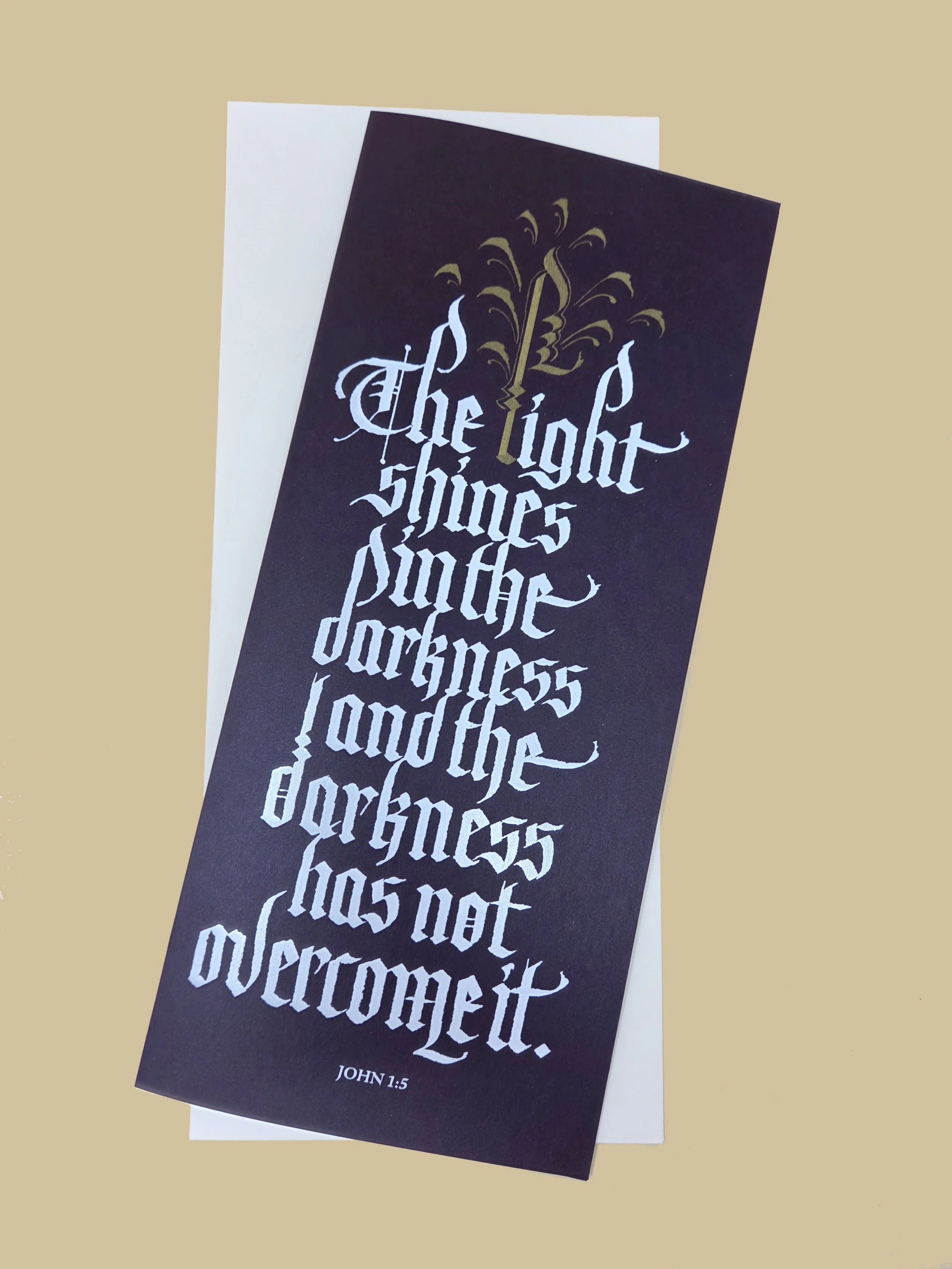
Diane specializes in old school lettering techniques, as you saw above. The combination of hand lettering and scanning and digital printing can get complicated, especially when you want to use specialty toners or die cut shapes.
Diane has used the PDF for specialty toner (raster based) linked below, using the “Duotone” feature to make a Spot Color the printer can read. This becomes more complicated because Diane wanted to use two specialty colors. In order for that to work, two PSDs need to be created, one for Gold Toner and one for White Toner (and if there was a CMYK component, that would also need to be made separate) and then compiled into a single document using a program such as Illustrator or inDesign (anything that can keep spot colors in the palette).
This can be set up on our end for a small fee but might differ from your original vision depending on how the elements are set up. Always talk to us before setting up a file if you know the final stage will need editing on our end so you are not wasting time on steps we won’t need or will need to disassemble.

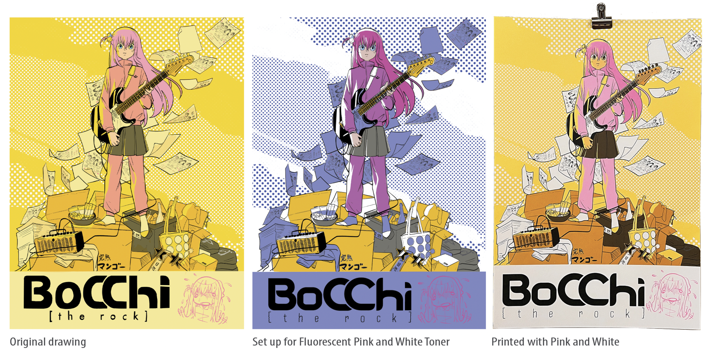
We pride ourselves on digital printing+, it isn’t just toner on paper! The paper itself can add a whole different texture or shine, then the toner lays differently from paper to paper, gold and silver shimmer, and fluorescent pink adds vibrancy.
None of these can be fully captured by a photo, much less a digital proof. The cut and finishings can really enhance and CHANGE the final product too. If you have time in your project to request a physical proof (if you’re out of town we can always mail one to you), we highly recommend it. Even out of state proofs can easily be done—with enough time in your schedule.
In cases like Diane’s above, we understand that some files cannot be sent as a vector because they were created either in traditional media or a raster based program. But what if you want specialty toner added to your non-vector art? This PDF was made to help.(If I did this right it will download a PDF when ya click the image below! Or click here!)

Always doing her best~!